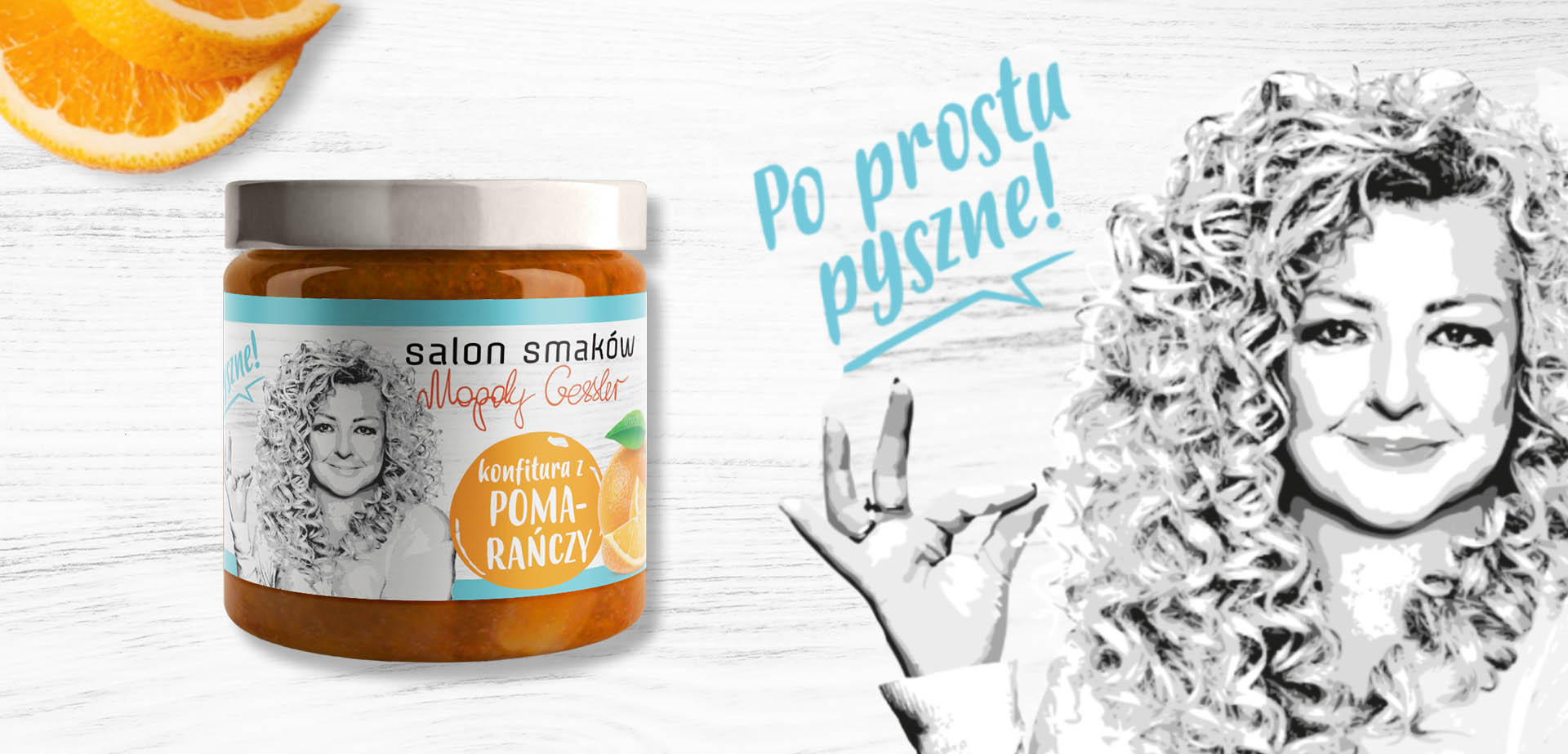
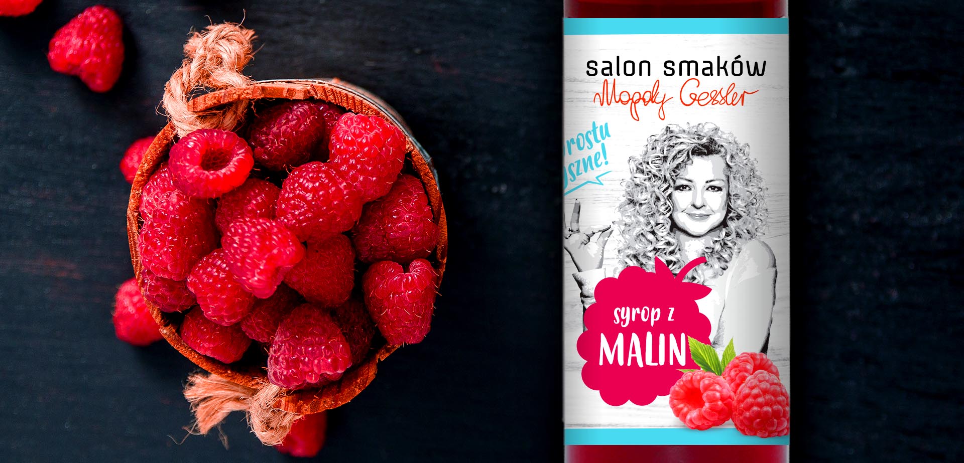
The market of jams and syrups, as well as additives such as pickled cucumbers, is very large in Poland. There is a growing interest in natural products, most consumers are looking for products with simple ingredients.

The new FMCG brand we are developing fits into this category. It also belongs to the brands that use celebrity images on their packaging. In this case, a well-known person who enjoys unflagging popularity and recognition – Magda Gessler.

salon smaków Gessler

Papajastudio agency tasks included:

  • category reconnaissance,
  • benchmarking,
  • analysis of target groups and customers,
  • preparation and execution of original strategic workshop,
  • developing branding assumptions, determining the brand’s DNA, including defining its values, archetype, personality and defining the essence,
  • building the main message of the brand,
  • naming,
  • logo design,
  • designing masters, i.e. model layouts of labels for all product categories,
  • selection of typography and colors,
  • advice on the selection of packaging (jars + caps),
  • author’s supervision over printing of first labels and cap branding,
  • launching guidelines for the brand launch on the market, including definition of sales channels in Poland.

Genesis of naming:

The name “Salon Smaków” emphasizes the wide offer of the brand, because salon is immediately associated with diversity and choice. The very word “salon” also has a lot of elegance in it, it’s a meeting place, prestigious in a way, festive. Overall, “Salon Smaków” sounds enticing, prestigious, but inviting.

The criteria for choosing the name:

  • Naturalness (simplicity of ingredients),
  • Affordable luxury (prestige),
  • Reliability, honesty, truthfulness,
  • Easy to pronounce and remember,
  • Free Patent Office,
  • Certifies high quality products.

The creative team’s task was to design the packaging for a new brand of food products to be available in large supermarkets as well as natural food stores.

The graphic idea is naturalness, recognition of the ambassador and prestige of the products. The main brand message that resounds from the design of the labels is: “real preserves”.

Elements of the visual brand story, such as typography (typeface), colors, the way of presenting photos, as well as the characteristics of each product, the architecture of information on labels, the way of presenting different flavors in each category, consistently emphasize such features as: simplicity of composition, affordable luxury of the brand and high quality, understood as a very good taste of products.

syrop Magda Gessler

See similar projects

Rebranding

Promedica24

Branding, packaging

Fiberistic

Branding, packaging

Konspol

Rebranding, packaging

PB Nails