Promedica24, a leader in the elderly care category, did not have a visual identification system that reflected its position on the Polish and European markets.

Papajastudio’s creative work for Promedica24 included a category analysis, logo facelift, design of a brand differentiator, brand slogan, brand book, brandbook, visual identity system, system for marking branches in Poland, Romania, Lithuania, Latvia, Ukraine, Germany and the UK.

Our task was to create modern communication language and adjust it to particular groups of recipients. Both inside the company (corporate identity) and outside. Thanks to the combination of blue and green colors we were able to reach both business and caregiver groups with our messages.

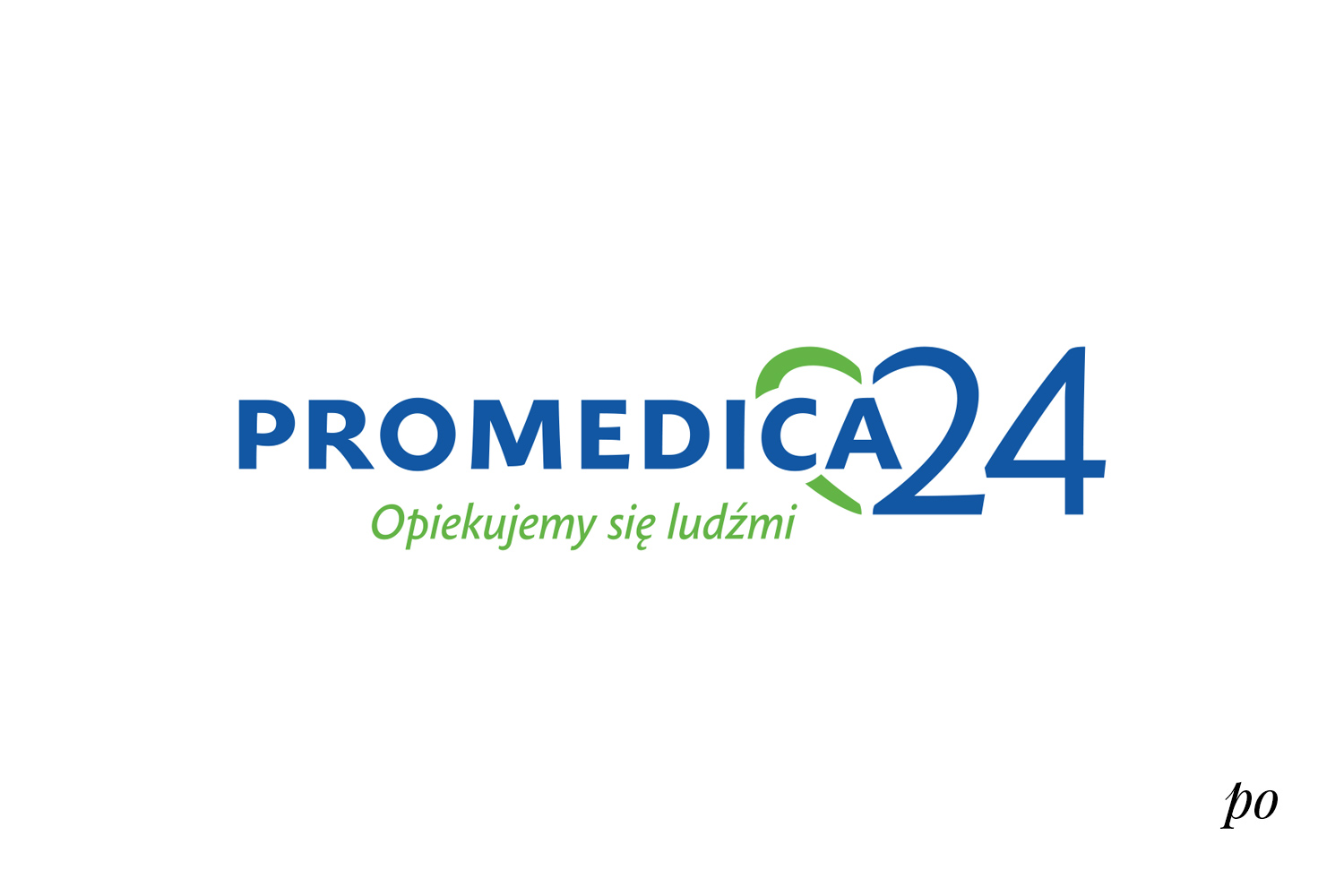
The previous Promedica24 logo did not stand the test of time. We modernized its typography and also refined the ending of the logo, i.e. “24” by building a heart in the sign. Thanks to different saturation of colors and different spelling of the name we built the foundations for a modern system of visual identification. Additionally, adding the company slogan “we take care of people” allowed for targeted positioning of the brand in an appropriate category.

The comprehensive scope of Papajastudio’s branding work included:

  • category analysis,
  • logo lifting,
  • designing a brand differentiator,
  • brand slogan,
  • Brand Book,
  • visual identity system,
  • branding of branches in Poland, Romania, Lithuania, Latvia, Ukraine, Germany and Great Britain.

Promedica24 image materials are divided into: corporate (business – based on graphics) and sales (helping in the recruitment of new caregivers – based on graphics and photos). Both types of materials have in common: minimalism, clarity, green-blue theme and the use of typefaces of one family. Promedica24 after the rebranding is synonymous with: care, commitment, reliability and safety.

See similar projects

Rebranding

Wiśniowski

Rebranding

Immergas

Branding

Tramwaje Warszawskie