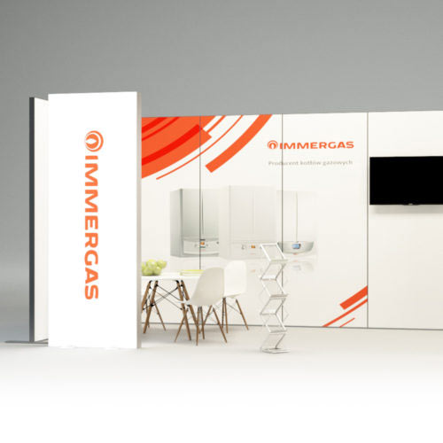
The Italian brand Immergas has been present in the heating industry for 50 years.

It is one of the leaders in the industry providing the market with the latest heating technologies. Together with the client, in a partnership atmosphere, we took care of defining the essence of the Immergas brand, taking into account the Polish context. We also designed an adequate and coherent visual brand identity and developed strategic guidelines for further communication activities.

Graphic design of visual identity system for Immergas Polska is based on motifs resulting directly from the shape of the logo, as well as stove internal structure that we analyzed. The graphic design of the Immergas motif is characterized by simplicity and clarity, according to the main design rule that we follow at Papajastudio – the more economical the solution, the more sensible it is.

The typeface family we used in the project is Seravek. The typeface designed by Eric Olson is friendly on one hand, and technical and expressive on the other.

Papajastudio’s comprehensive scope of branding work included:

  • strategic workshop,
  • defining the essence of the brand,
  • creating a coherent system of visual identity,
  • design of sample printed materials,
  • design of advertising materials,
  • audit of points of sale,
  • design of point-of-sale signage including product display system (boiler displays, catalog stand, controller stand)
  • price marking, guidelines for communication formats inside and outside the point of sale,
  • strategic guidelines for further communication activities,
  • development of Brand Book,
  • author’s supervision over implementation.

See similar projects

Rebranding

Wiśniowski

Rebranding

Immergas

Rebranding

Promedica24

Branding, packaging

Vemmio