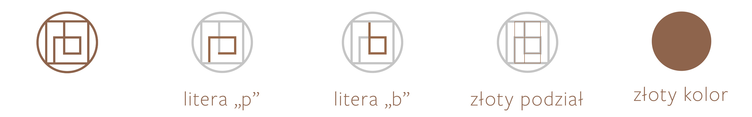
The longer a brand operates on the market, the greater requirements customers have towards it. Therefore, once it feels that it has built a solid foothold, it should put a lot of effort into conscious, planned shaping of its image.

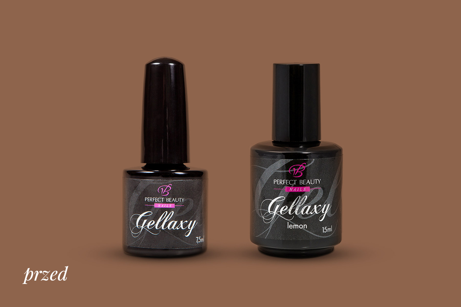
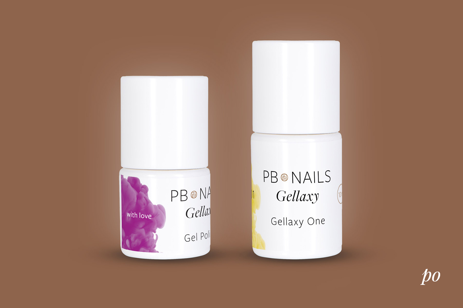
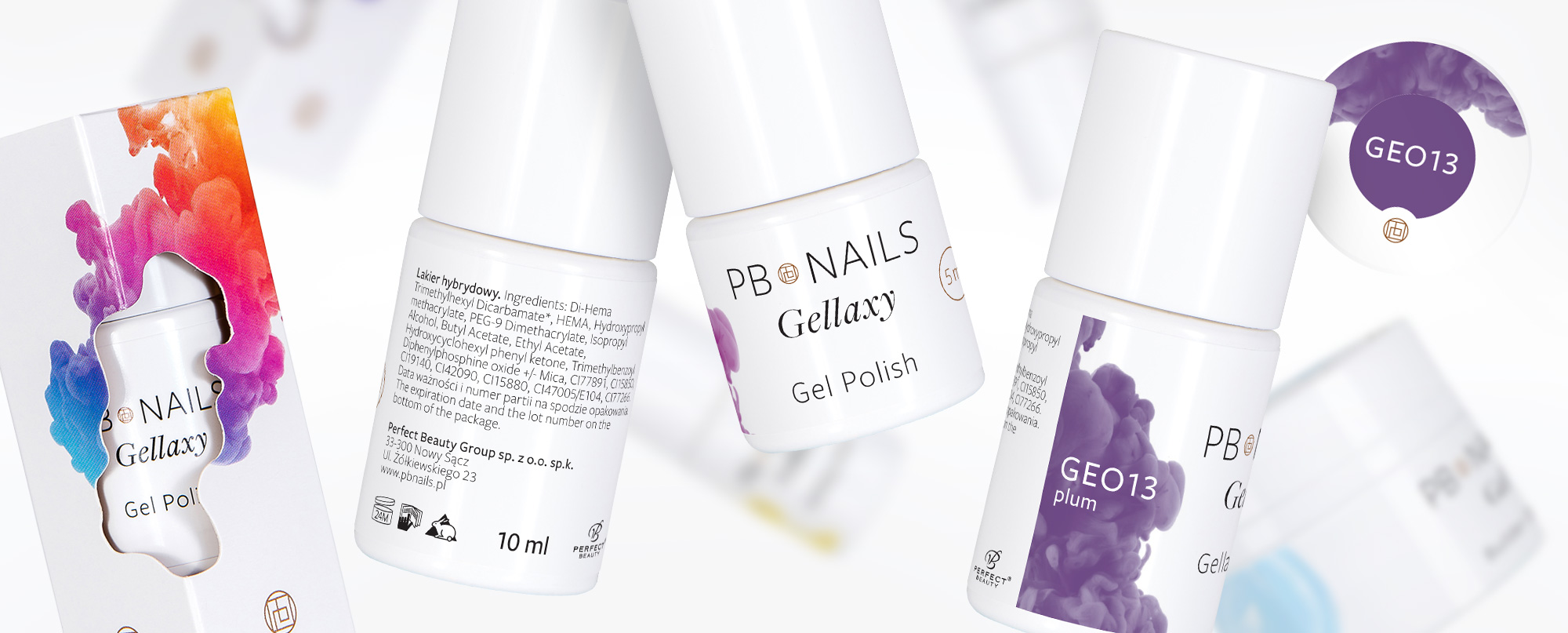
After 10 years of operation and observing changes in their industry the owners of Perfect Beauty Nails have decided to comprehensively rework the subject of branding their brand.

Rebranding included changing the name, designing a new logo, changing the packaging (its color and shape), as well as organizing the information architecture. Distinctive brand signet is in the color of copper gold, being a monogram of its initials. On the labels, we designed distinctive graphics to distinguish product categories (hybrids, gels, acrylics) and allow users to intuitively find the color, name and number of the product. We selected the Freight font family, an elegant font that builds product legibility.

Front etykiety

Nowe logo marki głównej i submarki, nowy system na nazewnictwo produktów.

Kolor lakieru

Widoczny jest z boku na grafice. Znajduje się tam również jego nazwa i numer.

Etykieta wieczka

Dzięki dodatkowej etykiecie z numerem z łatwością rozpoznamy właściwy produkt.

Ikony

Czytelne ikony i przemyślany sposób ich umiejscowienia na tylnej etykiecie.

Rewers etykiety

Dbamy o każdy szczegół opakowania. Właściwy układ informacji, nowoczesna typografia gwarantują czytelność i przyjemność użytkowania.

Opakowanie

Zaprojektowaliśmy charakterystyczne wycięcie, wynikające z grafiki kategorii. Widać dzięki niemu produkt.

Papajastudio’s creative work included:

  • strategic workshops,
  • image audit,
  • brand consulting,
  • field interviews,
  • social media strategy,
  • naming,
  • logo rebranding,
  • sub-brand logo design,
  • packaging rebranding,
  • new packaging design,
  • complex corporate identity project.

The main idea of the work was to show professional character of the brand and emphasize quality of the products. The brand is distinguished by the fact that it was founded by a stylist and for stylists who love their work. As part of the communication strategy, we combined multiple product lines under a common umbrella.

A combination of insights from field interviews led to a name change to a shorter and easier to communicate name. PB Nails has hundreds of products in its portoflio that needed to be redefined and given a common language.


307

setki dobranych kolorów

Case study:

Rebranding Wiśniowski

Continuous and consistent brand development.

SEE CASE STUDY

Launching Brumm

New brand in the automotive chemical industry.

SEE CASE STUDY

See similar projects

Rebranding

Promedica24

Branding, packaging

Fiberistic

Naming, logo, packaging

Salon Smaków

Branding, packaging

Brumm