Our task was complex branding of the new brand:
- conducting an analysis of the automotive chemical sector in Poland,
- naming,
- logo design,
- creating concept of packaging master design,
- design of a full series of packaging (45 pieces),
- development of 270 original pictograms,
- preparation of die-cuts,
- selection of materials,
- author’s supervision over implementation,
- design of POS materials,
- development of a slogan for a campaign introducing a new product,
- website design.
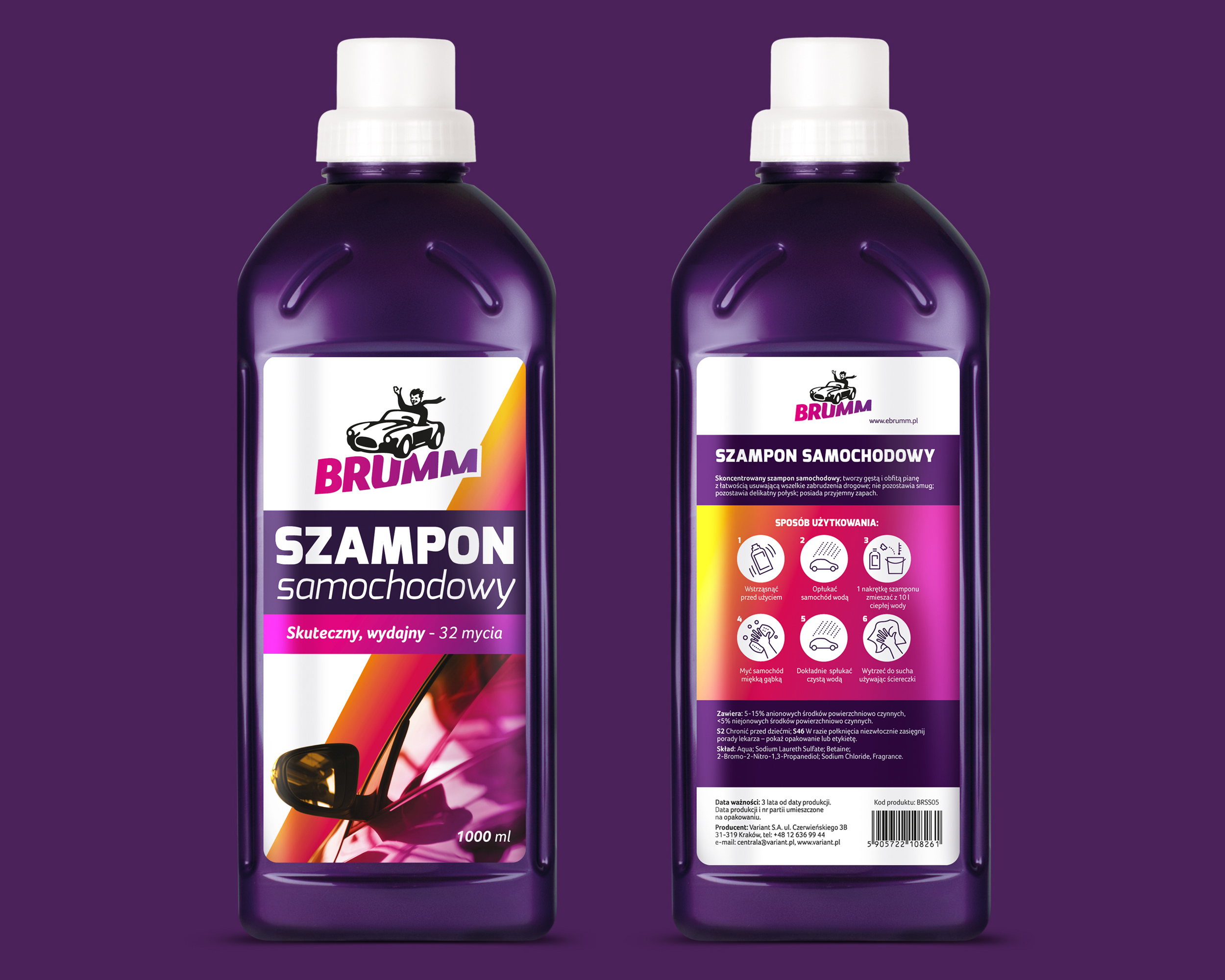
Brumm, as a commonly known onomatopoeia, became the name of the new brand. Directness in communication and openness of Brumm is also emphasized by its logo. The logo consists of a graphic motif depicting a scaled-down, smiling figure with his right hand raised in a greeting gesture, in a convertible car. Under the figure there is a colorful inscription “BRUMM” trimmed from the bottom in the shape of a wave. The dynamics of the sign is enhanced by the tonal transitions of colors from magenta to violet.
45
packs


Graphic line of packages is based on bold colors resulting from the logo to which orange was added to enliven and brighten the packages. Until now violet has not been completely used in the cosmetics and car accessories industry. Thanks to orange elements, the color scheme of packaging emphasized cheerful and friendly nature of the brand.
We created clear and transparent information architecture, where the visibility of logotype and name is the most important thing, as well as on the legibility of supplementary signature. On the right side of the label there is always a color theme and a picture characterizing the product.
The back of the packaging is a huge amount of information required by law, presented with the greatest care for the logic of reception, size and type of font. We have also taken care to make the information on the use of the product as clear as possible, therefore, we have designed dedicated pictograms, illustrating how to use the product.
Kolorystyka, która wyróżnia produkt na półce sklepowej.
Czytelna i przejrzysta architekturę informacji, gdzie najważniejsza jest widoczność logo.
Czytelna nazwa rodzaju produktu i jego zastosowania
Po prawej stronie etykiety zawsze znajduje się kolorystyczny motyw i zdjęcie charakteryzujące produkt.
Zaprojektowaliśmy dedykowane piktogramy, ilustrujące sposób używania produktu.
Rewers etykiety zaprojektowany z największa uważnością dotyczącą zachowania logiki odbioru, wielkości i rodzaju fontu.
270
original pictograms
Our task was also to select materials, including the types of plastic gloss, types of paper used for labels and boxes, as well as degrees of pearliness of the labels.
Although each package is ordered from a different supplier around the world, they all have the same color scheme, so the brand remains consistent.