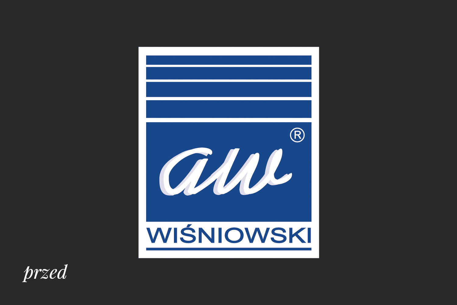
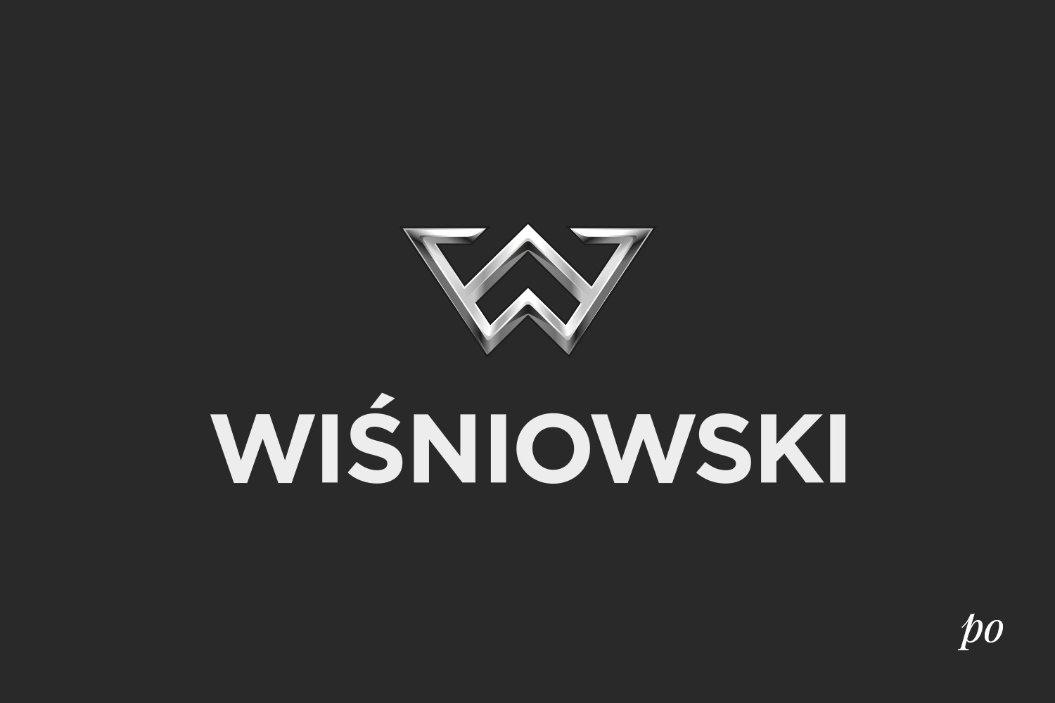
The new sign has completely broken with the old image. The new logo is modern, strong and characteristic. The colors of the new logo refer to precious metals, as well as aluminum and steel, emphasizing the industry, prestige and the highest quality of workmanship, which is what the company offers its customers. The chosen typographic family appropriately emphasizes the brand features, and light gradients build the spatial form of the logo.
Our task was to conduct a comprehensive change in the client’s visual identity system, including:
- image audit,
- local inspections at points of sale,
- analysis of product labeling,
- design of a new logo,
- design of sample corporate identity materials,
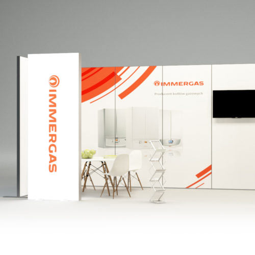
- design of advertising materials,
- point of sale signage desig
The majority of Wiśniowski brand’s target group are men, hence the logo shows aspiration, development, innovation and high quality of products. In addition, one can see in the logo, apart from the owner’s initials (A.W.), arrows pointing upwards, which emphasizes the dynamic growth of the company. The arrows are also an allegory of the markings on boundary poles, which suggest and emphasize the basic function of the brand’s products – marking out and enclosing land and one’s own space.
After designing the logo, we started working on job-related materials, aimed at customers and business partners. Another challenge was to create a point-of-sale signage system.
The consistent use of colors, the strong logo, Gotham typography and well-thought-out information architecture distinguish Wiśniowski not only from the competition but also from the entire construction industry with their simplicity and elegance.
Every rebranding is evaluated by the market, and it is the brand customers who decide whether it can be considered a success or not. The change of Wiśniowski brand image, which we had the pleasure to work on, took place in 2012 and now, with the benefit of hindsight, we can confidently say that it is a huge success of the company.
Reliability, innovation, prestige and durability are synonyms with which the Wiśniowski brand wants to be and, thanks to the new identity, is identified.
The Wiśniowski brand mark was included in a list of the best graphic signs at the 2nd National Exhibition of Graphic Signs. The entire rebranding process was considered exemplary and travels with the exhibition throughout Poland and Europe.