Browar Warszawski is a concept that combines a restaurant with high quality cuisine, bar and brewery. It was created in a place where the history of one of the most important beer corners on the map of Europe was written.

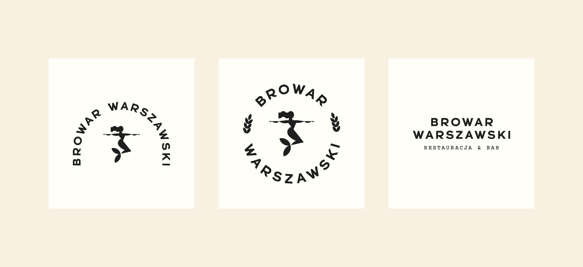
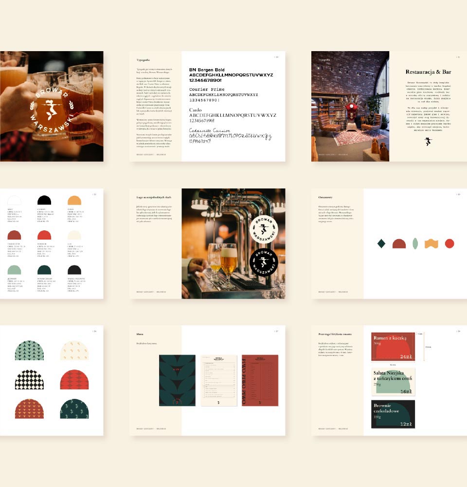
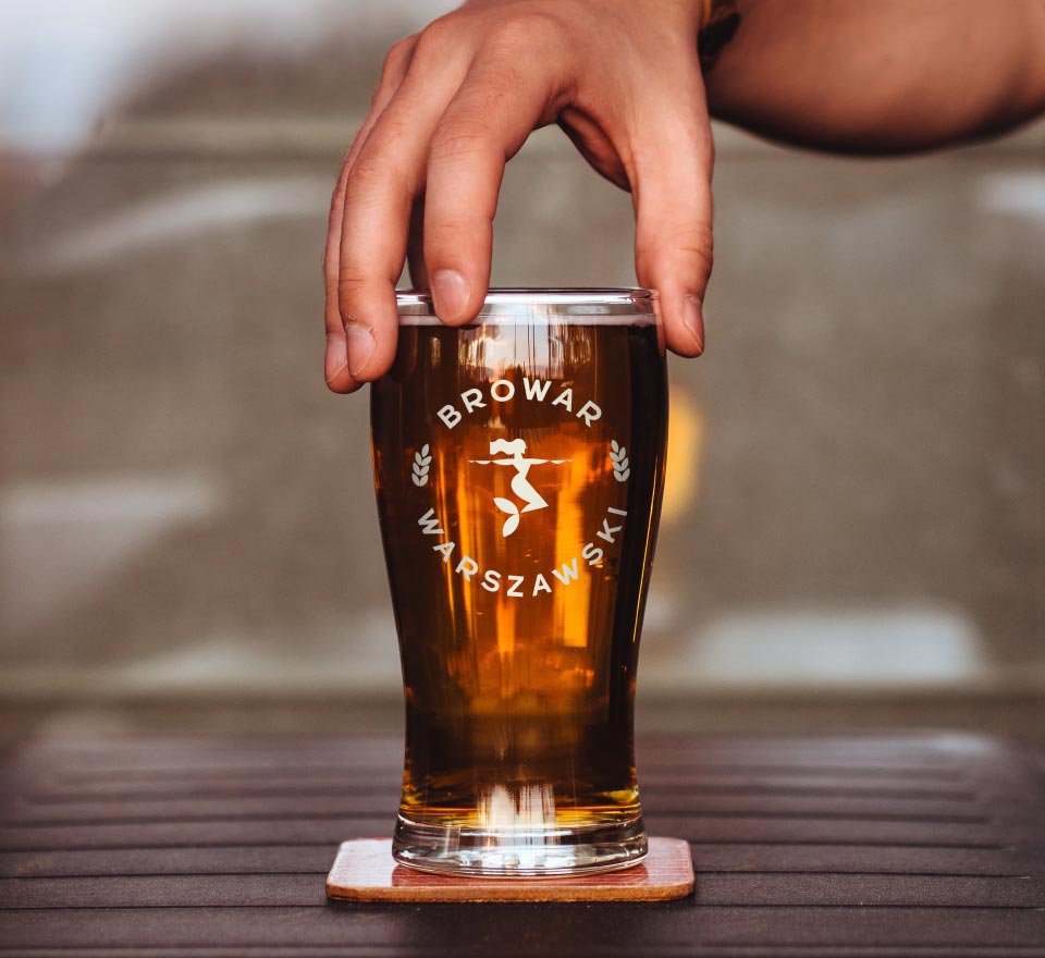
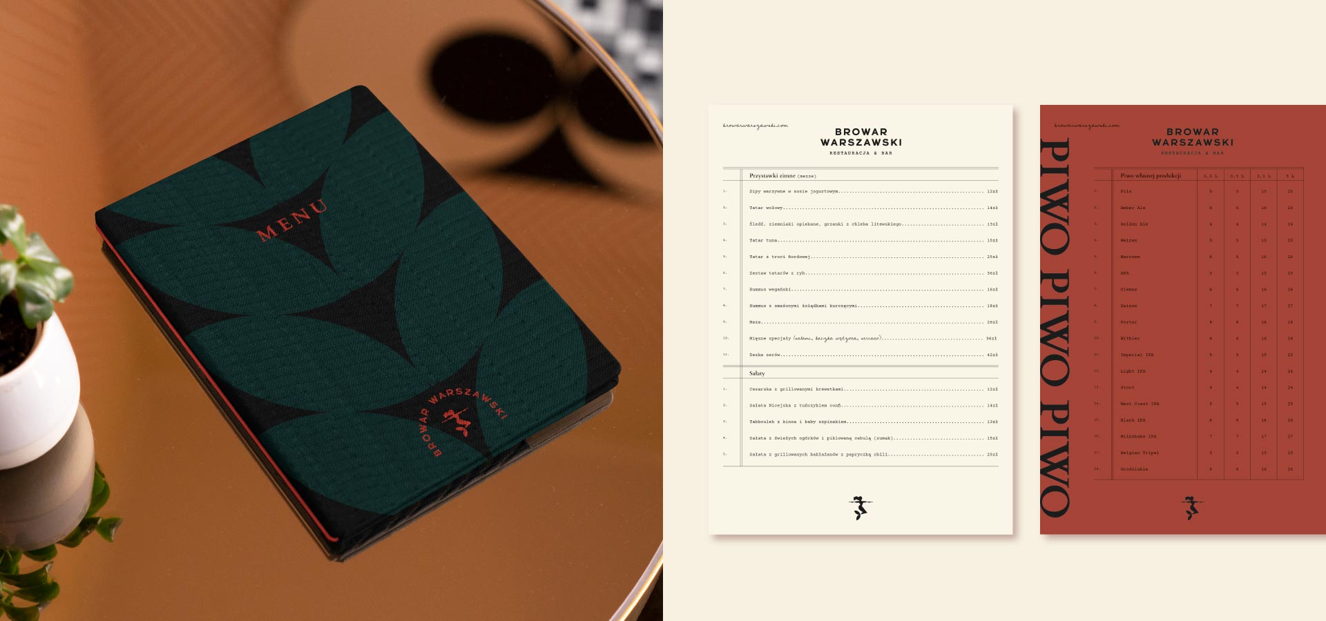
The design of the visual identity aimed at establishing a neat thread of communication between history and the present, reflecting the craft character, and juxtaposing the subdued elegance of the restaurant with the friendly tone of the uninhibited, relaxed atmosphere of the brewery and bar.

browar warszawski loga
browar identyfikacja wizyalna

The typography refers to typefaces found on old advertising materials or labels of the Haberbusch and Schiele Brewery. In the case of the color palette, we again reached for photographs and scans of labels, advertisements, posters, and other archives from the days of “that” brewery.

Both the geometry of the signet and the handwritten character of the typefaces are continued in the applications, patterns, beer labels, and compositions of digital and print materials, creating an attractive and consistent visual identity system.

As part of the project, we have created: a logo, an alternative logo, a visual identity book, patterns, a concept of menu, price labels, paper and cardboard packaging, a design of an internal and external neon sign, a number of applications on various materials – glass mugs, caps, mug pads, a concept of car wrapping, digital projects for social media and a series of labels for beer bottles.

browar warszawski branding
browar warszawski grafiki
browar warszawski materiały graficzne
browar warszawski grafika media społecznościowe
browar warszawski etykiety