logo kreska mąki
kreska mąki rebranding

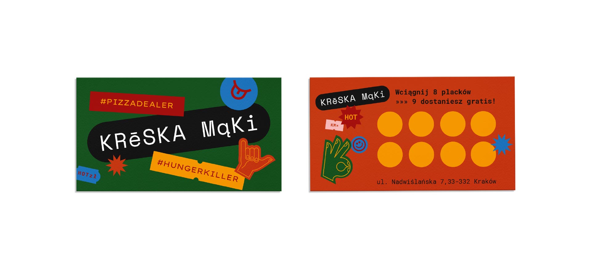
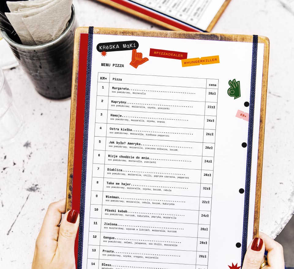
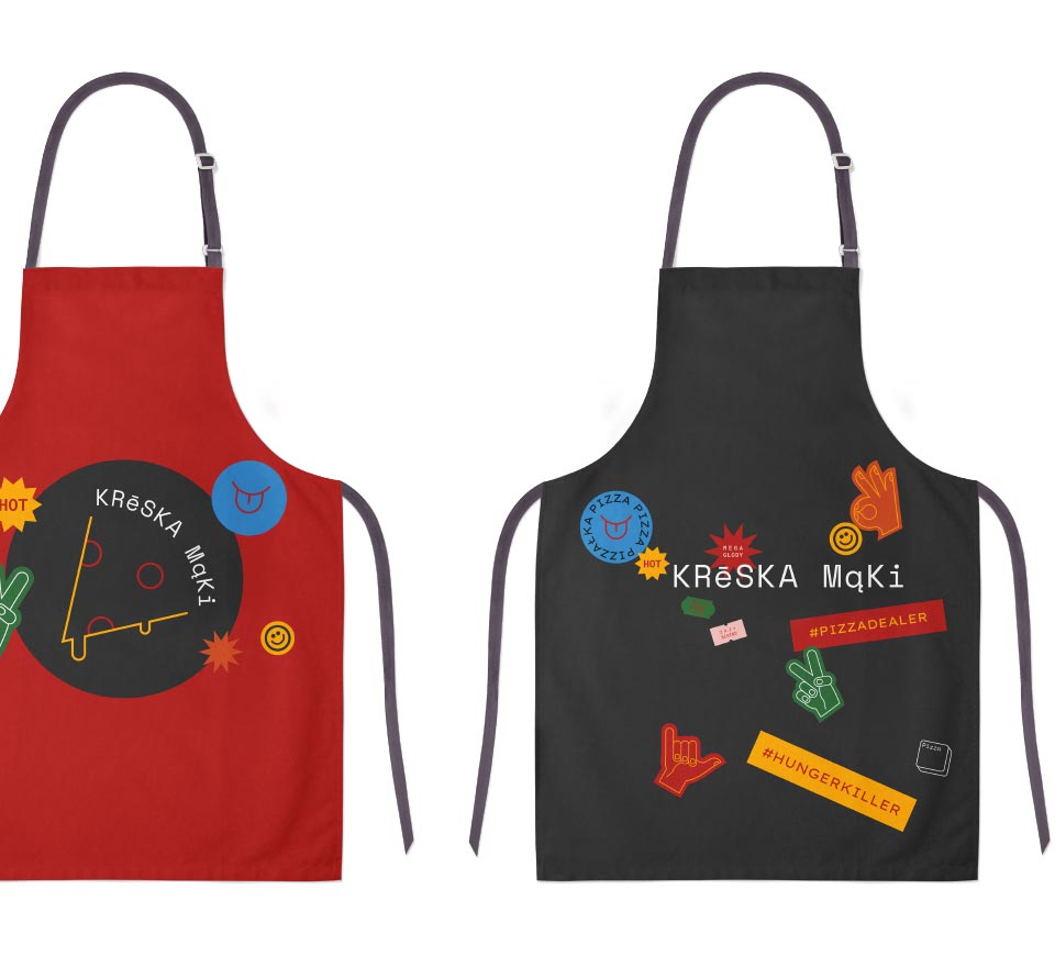
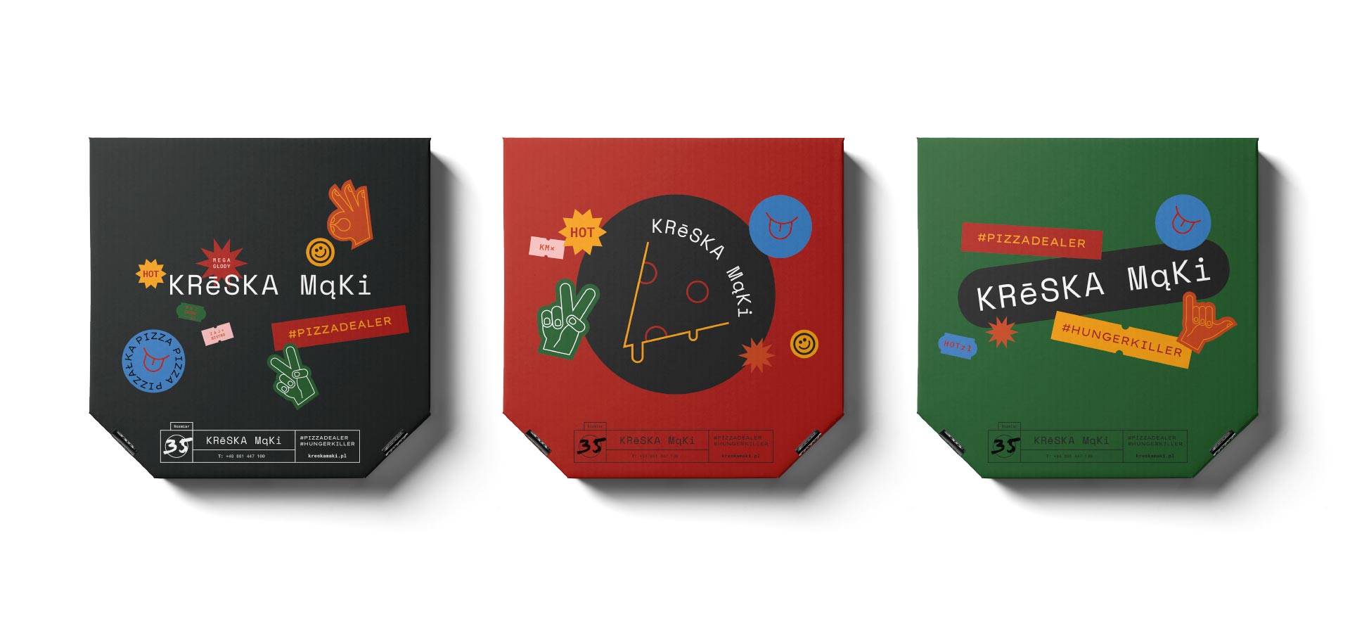
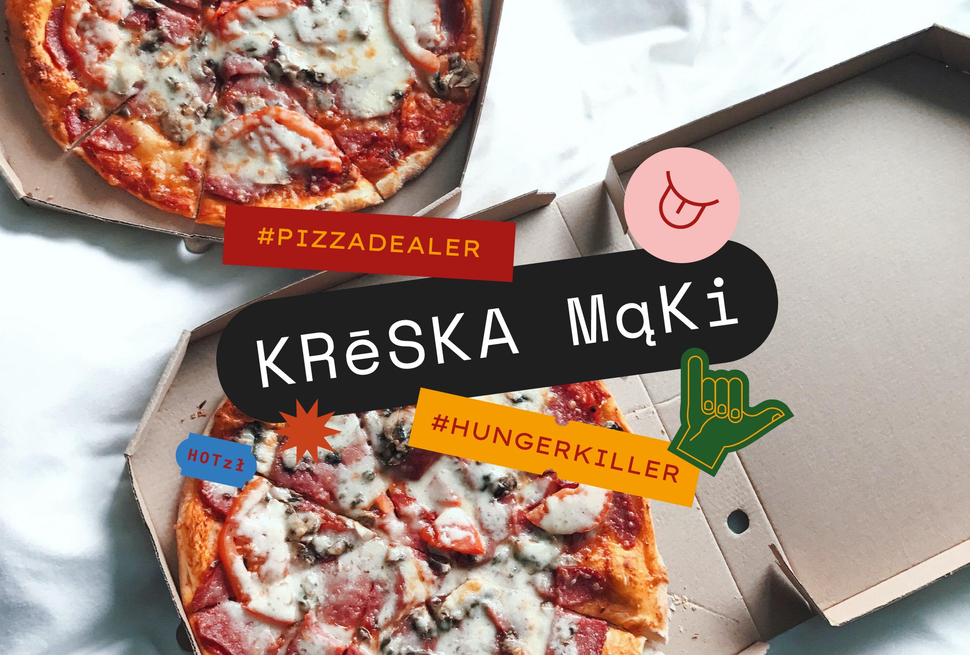
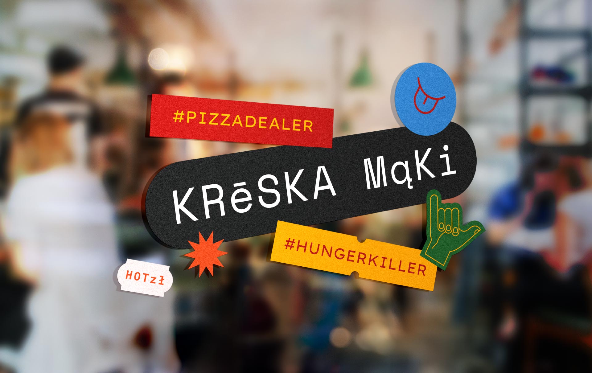
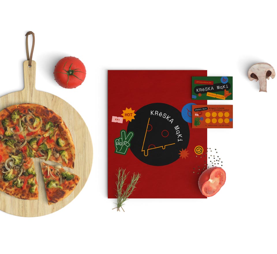
Kreska Mąki is a pub with chillout atmosphere and delicious Italian pizza. Interior is colorful, energetic with elements referring to pop-art and hip-hop. The brand message is direct and relaxed.

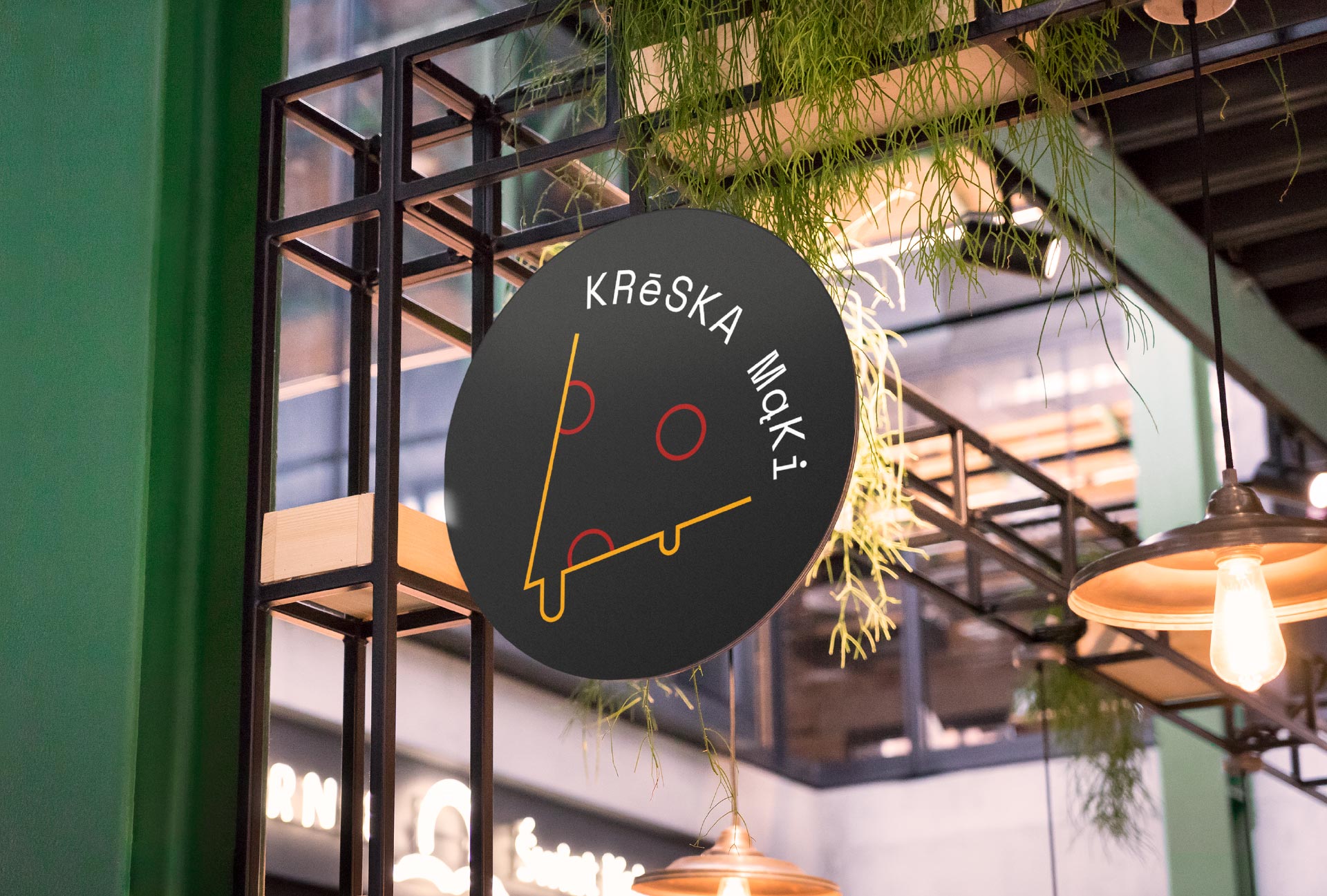
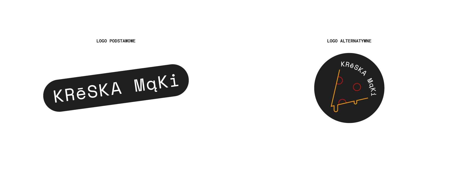
The main objective of the rebranding concept was to develop the potential of the already existing, cheeky name of the pizzeria and to build communication that would guarantee recognition and remembrance. The brand concept was based on the basic reason why people love pizza. This is the addictive property of casein contained in cheese that melts on the pizza.

kreska mąki materiały

The dynamic visual language of Kreska Mąki intertwines with playful verbal communication to create a suggestive, memorable whole. The brand philosophy is therefore very simple. The recipient is supposed to experience the exquisite flavours of Kreska Mąki in a friendly, relaxed atmosphere, and the visual and verbal communication is supposed to enhance this experience, entertaining the recipient and putting them in a good mood. And what’s next? Once you get a taste of Kreska Mąki, you won’t be able to stop coming back for it.

menu
kreska mąki fartuchy

Work on the concept included:

  • building the brand strategy,
  • logo design in basic and alternative version,
  • key visual,
  • development of verbal communication of the brand.
lokal
Materiały kreska mąki