Rebranding of Bemares, a Polish company providing top-quality products and services in the construction sector, was a necessary step to ensure that its image keeps pace with the company’s dynamic growth. The new visual identity communicates to clients the values developed by the company as well as its strategies for the future.

The goal of our branding agency’s design process was to create a visual identity that not only strengthens brand recognition but also conveys the core values that underpin Bemares’ operations. These values were explored at the beginning of our collaboration with Bemares during the analytical phase of our work, in a joint strategic workshop. This research process allowed us to gain a detailed understanding of the brand’s history, current state, and future plans. This knowledge base provides valuable insights that guide our design decisions.
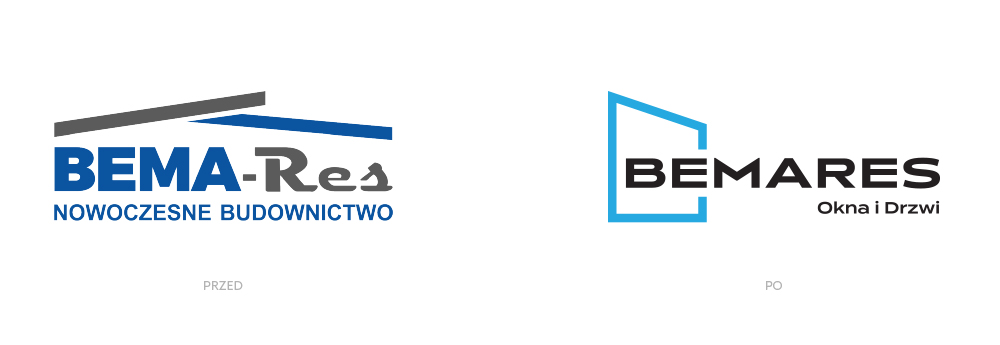
An image aligned with the brand’s identity
In recent years, Bemares has expanded beyond its local market. Its focus on high-quality products—such as windows, doors, and garage gates—as well as a commitment to professionalism in consultancy and services, has been driven by multiple factors. Prioritizing quality was not only about meeting customer needs, ensuring satisfaction, and providing a sense of security, but also about long-term strategic insights. High product quality signals reliability and durability, ensuring longevity and supporting ecological considerations.
Emphasizing quality is inherently linked to implementing innovative solutions. At a certain point, the company’s image no longer reflected its progress and the high standard of its services. Misalignment between brand image and identity can have severe consequences, and in this case, it was limiting the company’s growth potential.
Design decisions
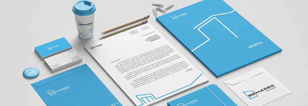
The new branding centers around a modern, geometric logo that symbolically represents the company’s area of activity, referencing the shapes of windows and doors. Accompanying the logo is a dynamic motif inspired by architectural forms and details. Lines follow the contours of windows, doors, and architectural elements, creating geometric arrangements in perspective.
Foundation in values and minimalism for timelessness
Minimalist and geometric designs have repeatedly earned audience approval and remained relevant for many years without significant changes. Moreover, branding grounded in core values can endure the test of time, lasting 15–20 years. In our understanding, this is what constitutes consistency and professionalism in visual communication. Time will tell whether Bemares’ new identity meets these challenges.