
Visual Identity in Polish Companies: A Case Study of the Largest Polish Gate and Fence Manufacturer
A brand’s image is its face, which should reflect its characteristics and aspirations. However, it often happens that a company develops rapidly while its visual identity remains unchanged. As a result, a large and potentially powerful organization can be perceived by customers, due to outdated visual identity, as a so-called “garage company.” This misperception affects how customers view its products.
What is Visual Identity and Why Does It Matter?
Typically, a company’s first visual identity is created at the start of its operations. Often, the main motivation is market conformity: other companies have logos, so a logo must exist. At this stage, the process is rarely strategic, and budget constraints often limit its quality. Visual identity is frequently seen as an unnecessary expense.
The situation differs for entrepreneurs aware of the importance of visual identity. This group focuses on creating a well-developed brand image even before launching the business.
However, many entrepreneurs lack the budget or awareness of how crucial visual identity is during the company’s early stages. This was common in the early 1990s, when new companies sprang up rapidly. Over the years, the best companies survived and grew, but their visual identities often lagged behind, sometimes remaining entirely unchanged. A visual identity suitable for a small company becomes inadequate for a large enterprise.
An ideal example is Wiśniowski, whose visual identity sent conflicting messages. The brand appeared like a company just starting its journey to the top. The rebranding goal was clear: to communicate the strength and value of Poland’s largest gate and fence manufacturer. Aware of its needs, Wiśniowski sought a way to convey its brand spirit through visual identity.
The Rebranding Process
Changing a company’s image is a complex and demanding process. It requires:
-
a complete understanding of the brand,
-
jointly setting strategic goals,
-
understanding the brand’s history and needs, as well as those of its audience,
-
analyzing the market context.
It is not enough for only the branding agency to understand these aspects. The brand itself—and all decision-makers—must have this awareness. Rebranding can be summarized as finding means of expression through which the brand’s goals are translated into visual form. In simple terms, it is about illustrating ideas.
Rebranding is precise work that leaves no room for mistakes. Any wrong decision can lead to rejection of the new identity by customers, harming the brand image and negatively impacting financial results. Many examples confirm this. One well-known case is GAP, which reverted to its pre-rebrand visual identity following customer backlash.
Visual Identity in Practice: The Rebranding of Wiśniowski
a. Understanding Client Expectations, Designing a New Logo, Corporate Materials, and Sales Point Signage
The entire Papajastudio team was aware of the importance of this project and the trust placed in us by Wiśniowski when they commissioned the rebranding. The collaboration began with a deep understanding of the client’s expectations, as only a full comprehension allows for the creation of an optimal visual identity. Without this insight, designers can only illustrate their own perception of the brand, which may not align with the company’s actual needs. Unfortunately, this stage is often skipped or not given sufficient attention. At Papajastudio, we know that such an approach rarely leads to success.
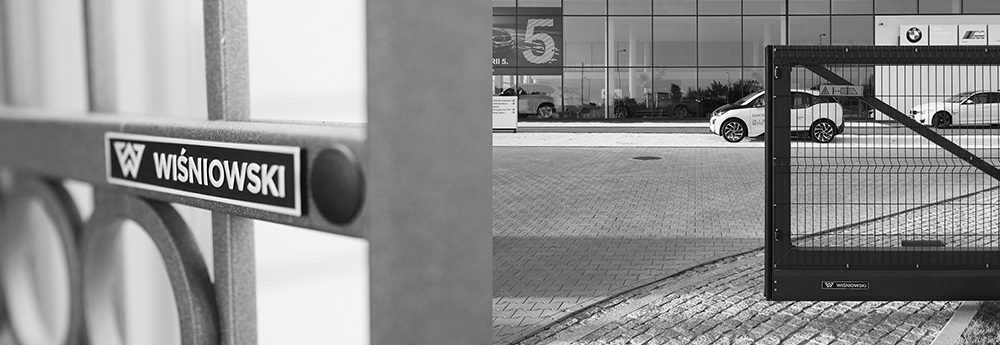
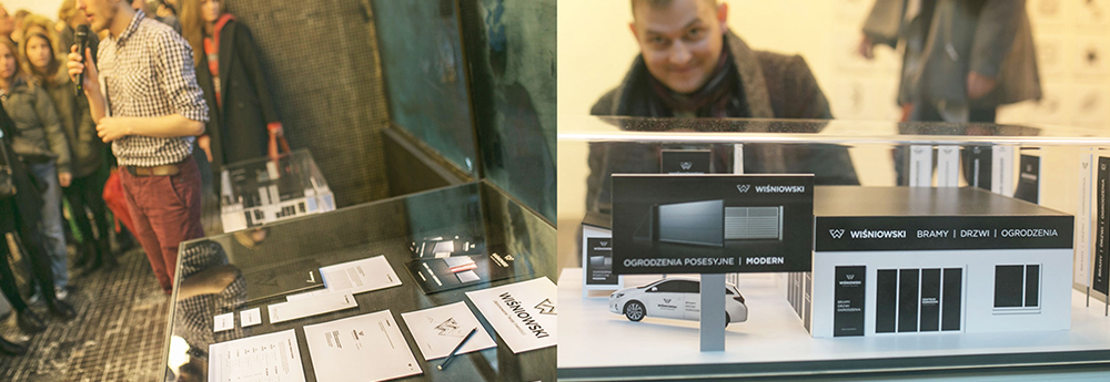
Based on an analysis of Wiśniowski’s development strategy, we made comprehensive changes to the client’s visual identity system. The work included designing a new logo, corporate and promotional materials, and a proposal for exemplary sales point signage.
The first stage produced three logo proposals. Before presenting them to the client, optical tests were conducted, and the intended media for the new logo were considered. It is crucial to account for how the logo will appear on various materials and formats. Designing a visual identity that is impractical, difficult to implement, or costly to produceserves no purpose.
After careful evaluation, the proposals were presented to the client. Our preferred option, which best represented the brand’s essence, also became the client’s choice. This was not a “safe” design but a revolutionary change. The Wiśniowski team demonstrated excellent business intuition and openness to bold decisions.
The accepted logo reflects the brand’s aspirations, growth, innovation, and high product quality. Through a well-directed strategy and thoughtful design, Poland’s largest gate and fence manufacturer positioned itself as an international player capable of competing in European markets — says Joanna Słysz, Project Coordinator.
The logo’s color palette references noble metals, aluminum, and steel, highlighting the industry, prestige, and top-quality craftsmanship. Metaphorically, it draws inspiration from automotive branding, as Wiśniowski’s flagship product — garage doors — is indirectly associated with automobiles. Considering that a majority of the brand’s customers are men, this automotive reference is highly appropriate.
Subtle elements in the new logo include the owner’s initials and references to the flagship product, a remote-controlled garage door. Upward arrows symbolize the company’s dynamic growth and also allude to boundary markers, reflecting the core function of Wiśniowski’s products — defining and securing spaces. Light gradients create a sense of dimensionality in the logo.
b. Applying the New Visual Identity Across Media, Brand Architecture, and Brand Book
Once the client chose the logo, the next phase of the visual identity update began. This involved applying the new identity across all necessary media, including sales point signage, office materials, promotional items, and vehicle graphics.
It was also essential to develop brand architecture, selecting key products for immediate emphasis while ensuring flexibility for future promotional needs. The goal was to create a universal solution providing the brand with practical tools.
A brand book was produced to guide the proper use of the new visual identity, ensuring consistent communication. At Papajastudio, we focus on delivering functional tools that enable the brand to independently create materials in the future. However, to ensure success — including visual consistency and proper application — the continued support of the rebranding team is often necessary during the early stages of independent brand communication.
c. The Results of the Rebranding Process
Every rebranding is ultimately judged by the market, and it is the brand’s customers who determine whether it is successful. The Wiśniowski brand refresh took place in 2012. Looking back now, we can confidently say it was a huge success. Reliability, innovation, prestige, and durability are the qualities Wiśniowski wants to be associated with — and thanks to the new visual identity, it now is.
This success would not have been possible without the owner and employees of Wiśniowski, who consistently implemented the new brand image. Moreover, the change was positively received not only by the market but also by the branding industry. The new Wiśniowski identity was featured among the best graphic marks at the National Graphic Symbols Exhibition, and the entire rebranding process was recognized as exemplary.
Summary
It is important to emphasize that updating a visual identity is a process that takes time. At Papajastudio, we understand that careful, deliberate actions are required, and there is no room for designer ego — creating designs based solely on personal taste, detached from the client’s needs, is counterproductive.
A branding agency’s role is to translate the client’s strengths into a visual language. Throughout the rebranding process, the agency provides knowledge and essential tools, working to ensure the client’s success. For the client, the rebranding translates into new relationships with their customers, which ultimately lead to increased sales.