

Rebranding is more than just a new logo. It’s a strategic move that refreshes a brand’s image, communicates new values, and aligns it with a shifting market. The year 2024/25 has seen numerous successful transformations that offer valuable insights. Papajastudio – a branding agency based in Kraków and Warsaw – presents the Top 10 Rebrands of Recent Months and the key takeaways they offer.
1. Pepsi – A Return to Roots with a Modern Twist
Pepsi surprised the world by blending retro aesthetics with contemporary design. The new logo draws on the brand’s history but does so in a bold and fresh way.
Lesson: A brand’s strength lies in its DNA – embrace your history, but interpret it through a modern lens.
![]()
źródło: https://brandingmonitor.pl/nowe-logo-pepsi-polaczy-pokolenia/
2. Nokia – An Evolution Towards B2B
Nokia’s new visual identity marked a clear break from its consumer-focused image. The brand embraced a minimalist, corporate style, signalling a strategic shift towards providing technological solutions for businesses.
Lesson: Rebranding can be a powerful tool to clearly define a new market focus or business model.
![]()
źródło: https://brandingmonitor.pl/nokia-przechodzi-rebranding-ktory-ma-zmienic-postrzeganie-marki/
3. Burberry – Classic Style in a Contemporary Rhythm
The British fashion house refreshed its logo by returning to a classic typeface. The result? Luxury and timelessness without feeling outdated.
Lesson: Classic doesn’t have to mean stagnant. A well-executed rebrand refreshes without erasing identity.
![]()
źródło: https://www.adweek.com/creativity/burberry-gave-a-famed-designer-4-weeks-to-redesign-its-logo-and-heres-what-we-got/
4. X (Formerly Twitter)
Elon Musk’s controversial decision to transform Twitter into X sparked a wave of reactions. Though radical, the move aimed to signal the ambition of creating an “everything app.”
Lesson: Extreme rebranding can be shocking, but if backed by a strong strategic rationale, it can be effective.

źródło: https://www.forbes.com/sites/marcuscollins/2023/07/30/the-real-lesson-to-be-learned-from-twitters-rebrand/
5. Booking.com – Simplified Interface, Cleaner Identity
Booking.com refreshed its visual identity by introducing a clearer visual language and a responsive branding system.
Lesson: Rebranding isn’t just about aesthetics – it’s about improving usability and enhancing the user experience.

źródło: https://www.designer-daily.com/booking-com-rebranding-30771
6. Figma – Even More “Designer-Friendly”
Figma’s new identity is fresh, modular, and highly communicative. The rebrand goes beyond just a new logo – it reflects a complete overhaul of the visual communication strategy.
Lesson: Thoughtful branding means coherence at every level – from colour choices to motion design.
![]()
źródło: https://logos-world.net/figma-unveils-new-logo-and-brand-identity/
7. Reddit – A Bold Step into the Future
The social platform introduced refreshed iconography and a visual identity system optimised for mobile devices.
Lesson: Rebranding must account for new communication channels – especially mobile.

źródło: https://www.reddit.com/r/Design/comments/1871o99/reddit_rebrand_by_pentagram/
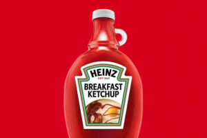
8. Heinz – Ketchup with Personality
Heinz developed a brand identity system full of humour and emotion, standing out both on the shelf and across social media.
Lesson: Don’t be afraid to give your brand character – branding isn’t just about being “pretty,” it’s about being human.
źródło: https://www.msn.com/en-us/foodanddrink/foodnews/heinz-is-officially-rebranding-its-ketchup-here-s-everything-we-know/ar-AA1GGAMy
9. Zalando – Less Is More
The change wasn’t dramatic but carefully considered – typography was simplified and the graphic grid refined.
Lesson: Subtle rebranding can be just as effective as a revolution – especially when the brand is already strong.
![]()
źródło: https://brandingmonitor.pl/zalando-wprowadza-zmiany-w-strategii-marki-odswieza-tez-logo-i-identyfikacje-wizualna/
10. YouTube Music – Integration with the Google Ecosystem
Aesthetic changes and improved visual integration with the rest of Google’s products.
Lesson: Branding should support the ecosystem – visual consistency enhances recognisability.

źródło: https://9to5google.com/2024/07/03/youtube-music-artist-page-redesign/
Conclusions and Inspirations – What Does 2025 Tell Us?
All the examples above show that rebranding is not a fad, but a strategic tool. What are the key trends?
-
Modularity of identity systems – branding needs to work flexibly across multiple channels and formats.
-
Humanisation of brands – more and more brands speak to people, not just the “market.”
-
Minimalism with character – simple forms, but with a strong distinctive edge.
-
A return to the past – vintage and heritage branding carry powerful emotional resonance.
Need a Rebrand That Works?
Papajastudio – a branding agency based in Kraków and Warsaw – specialises in creating and refreshing brands that are ahead of their time but never lose their identity. We help companies navigate the rebranding process strategically and sensitively.
Inspired by any of these transformations? Get in touch with us – we’ll help your brand find a new voice in 2025.